 There’s a certain irony involved when people enquire about photorealism because, apart from the spelling, there isn’t really anything ‘real’ about it. What we perceive as being ‘realistic’ in an image (or an animation, for that matter) has more to do with whether it’s consistent with our expectations of it, rather than whether it’s truly representative of the real world. Over time, we get used to certain motifs being rendered in a certain way, and any deviation from this stands the risk of being regarded as strange or unnatural. As an extreme example, imagine Godzilla painted in vibrant pink and yellow stripes. No matter how good the paint job is, or how cute he looks, the effect would still look slightly odd, to say the least.
Another important point to note is that whenever we look at a photograph, we’re not actually looking at reality itself, but a representation of it. Even though variables such as f/stop (focal ratio, or depth of field), motion blur, camera lenses, different film types and grain don’t exist in the world around us, we could rationally claim that the image we’re scrutinising is unrealistic if any of these variables are absent. In effect, we have to mimic not only reality but the equipment used to ‘capture’ it.
Given that realism is about a whole lot more than just activating the switch that simulates the light bouncing around in your scene, the following walkthrough sets out a selection of techniques for an effective final gathering workflow, including how to use FG in combination with ambient occlusion. The procedures can be further refined, and can be used all at once or separately, depending on your requirements. For now, pour yourself a new cup of coffee (purely as reference material, of course) and let’s get started.
The project files and the original tutorial as it appeared in 3D World can be found at http://www.computerarts.co.uk/tutorials/3d__and__animation/3d_worlds_question_of_the_month
It appears that the article and project files has been moved and is no longer available at the above address. If you want to download the project files, please use this link instead: http://dl.dropbox.com/u/3834689/CaffeineAbuse/StudioLighting.zip
Part 1 Shades of gray
 Step 01
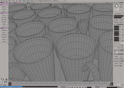
Start by open the coffeecup scene. The first thing we’ll need to do, which you should always do with any scene, is turning of the ambience light as this gives a flat and unrealistic illumination. Next, open an Explorer (shortcut [8]) and delete the default light as well. Your scene is now completely black so any illumination will have to be created, and more importantly, controlled by you.
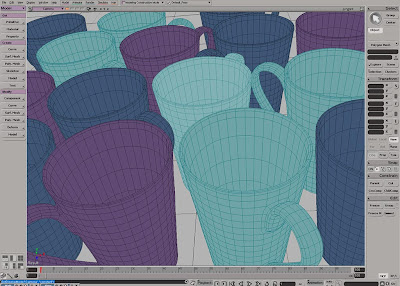 Step 02The lighting is difficult enough without having all the textures and materials complicating things further. At this stage you’re really only interested in getting the illumination to play properly so any redundant information in the image may cause unnecessary distraction. Nevertheless, a very common “mistake” made by a lot of 3d artist, is to set up the lights in a fully textured/shaded scene.
 Step 03
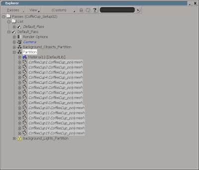
Seeing that the cups already have individual colors applied to them, you don’t want to modify their actual materials. Instead, you can temporarily override their local materials by putting the cups in a new Partition and apply a shader to the partition. So, select all the cups and press [3] to switch to the Render toolbar.
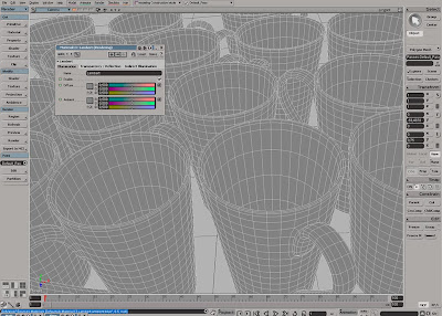 Step 04From the Pass > Partition menu chose New Partition. With the partition still selected, click Get >Material and pick Lambert. Set the RGB values for both the Diffuse and Ambient to 0.5 to ensure a neutral color. By limiting the objects to be lit in your scene to shades of gray, it will be a whole lot easier for you see the effect of the color and intensity of each light.
 Step 05
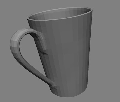
Apart from certain situations, the very purpose with your lights are to make you objects visible in a otherwise completely black environment. However, a well lit scene does more than just illuminate your objects, it defines them. While you’ll most likely strive to keep your models as smooth as possible in your final image, you can do the opposite as you’re setting up the lighting,
 Step 06
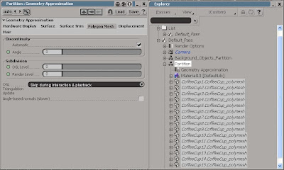
Again, with the partition still selected, click Get > Property > Geometry Approximation and switch to the Polygon Mesh tab. Each of the coffee cups is made by a number of polygons, which will be rendered as either smooth or faceted depending on your discontinuity settings. Set the Angle to 0 (zero) to ensure that the polygons will be rendered completely flat (you’ll se why in just a minute).
Part 2 Let there be light
 Step 07
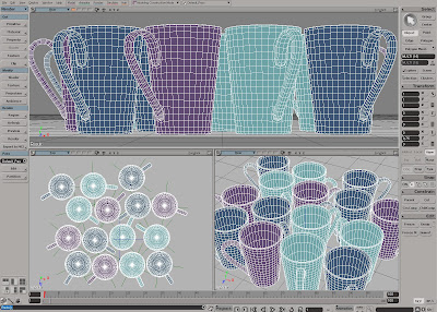
The idea is to start from a three point lighting setup, and refine it as you advance. But instead of the standard lights you’ll use 3D geometry with differently colored constant materials applied to them. As you progress trough the following steps, make sure to frequently draw a render region to se the effect each adjustment has to the scene
 Step 08
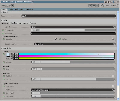
You do need at least one light for the Final Gathering (FG) to work, so start by creating a standard Spotlight from the Get > Primitive > light menu. Position the spotlight approximately at X: 6, Y: 3, Z: 0, set the Color to RGB 0.83, 0.88, 0.93 and the Intensity to about 0.4. Next, open the Render Options PPG (Render > Region > Options…). Switch to the FG tab in the PPG and check the Final Gathering checkbox to enable it.
Step 09
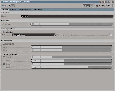
Increase the number of Bounces to 2. You can leave the rest of the settings for now. When it’s time to render the final image you can increase the Accuracy to 200 (or more), set the Min Radius to 0.2 and the Max Radius to 1. Let’s start creating the lights. From the Get > Primitive menu chose Sphere and change the setting according to the accompanying screenshot.
Step 10
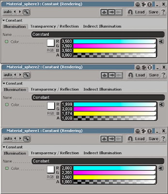
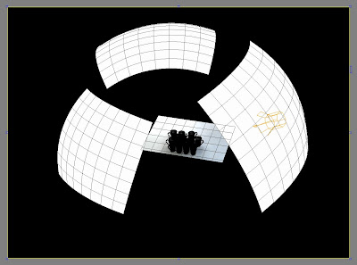
Rotate and position it just behind the spotlight. Apply a Constant shader and set the RGB to 2, 2.2, 2.5. Duplicate the sphere, make it slightly smaller (see next screenshot for how to position the spheres). Click Get > Material > MakeLocal Material and change the RGB to 1.99, 2.0, 1.57. Duplicate the sphere once again, make it larger and click Material > MakeLocal Material. Set the RGB to 3.5, 3.5,3.5 .
 Step 11
With all the lights roughly in place it’s time to fine tune their position and intensity, and this is where the flat polygons will be of great assistance. To get the most out of your light setup, strive for each of the cups’ polygons to have a slightly different shade than the adjacent. While you should work with one light at the time, seeing that you’re using final gathering, modifying one of them affects the entire scene.
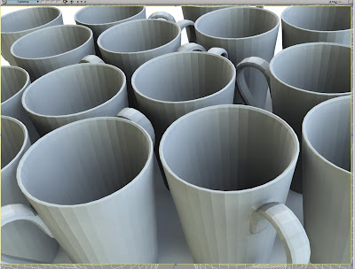 Step 12So for that reason you should work by going back and forth, making small changes each time. Note that the Accuracy and Radius settings in the render PPG also affect the illumination of the scene and not just the quality. Once you’re satisfied with the lighting, ether delete the partition (holding the overrides) or create a new Pass to revert to the cups original shading and materials.
Part 3 Ambient occlusion
 Step 13
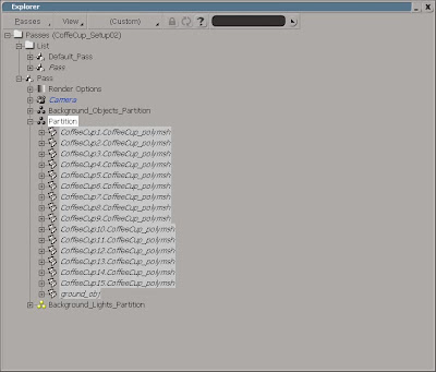
Even though you’re using FG to illuminate your scene, combining it with a subtle effect of Ambient Occlusion will place the cups on ground and add to the overall depth and richness of the image. From the Pass > Edit > New Pass menu choose Empty. Select all the cups and the ground object and from the Pass > Partition menu choose New Partition.
 Step 14
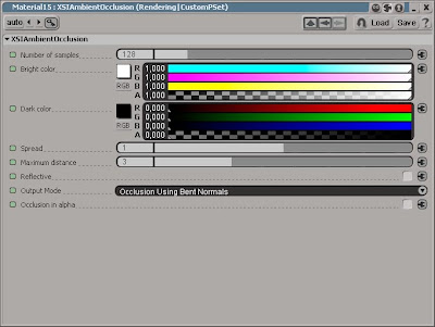
With the partition still selected apply any shader from the Get > Material menu and press [7] to open a Render Tree. Click Nodes > Illumination > Ambient Occlusion (AO) and connect the node to the Surface input of the Material node. Open the AO PPG and change the setting according to the accompanying screenshot. Open the Background_Objects_Partition’s PPG and set the Render Visibility to Hide Members.
Step 15
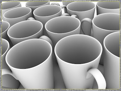
Once happy with the AO shader as well, it’s time to hit the longed-for render button. Note, as you’ll be doing a fair amount of adjustments to the mages, render them in 16 bit depths (using the .sgi file) instead of the default 8 bit. This will ensure the quality to hold throughout production. You should also render the images at a slightly larger resolution as the edges in the final image will need to be cropped.
Part 4 Adding mattes
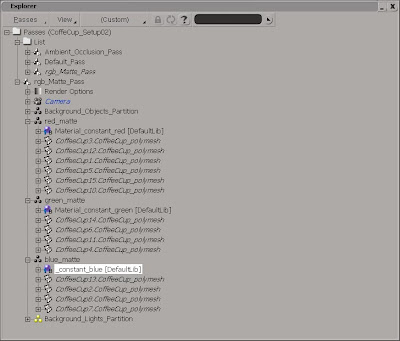
Step 16While the need for mattes may not be critical in this scenario, it can be the difference between a couple of minutes work in compositing or having to re-render an entire sequence. From the Pass > Edit > New Pass menu choose Empty and name it mattes. From the Pass > Partition menu, create three New Partitions and name them red, green and blue_matte.
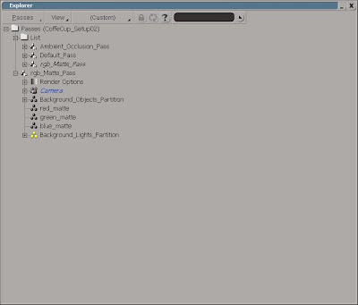 Step 17
Select the partition named red_matte and apply a constant shader. Set the RGB to 1,0,0. Apply a constant shader to the green and blue_matte as well, and set the RGB to 0,1,0 and 0,0,1. Select all the blue cups and, in the Explorer, right click on the red_matte portion and chose Add Selected Objects. Next, add the violet cups to green_matte and the turquoise cups to the blue.
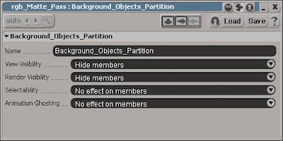 Step 18
Open the Background_Objects_Partition’s PPG and set the Render Visibility to Hide Members. Set the rendering output and format to the same as in the two previous passes and hit Render. Once completed, go to the View > Layouts menu and switch to Compositing. If you’re using XSI Foundation, you can use Photo Shop to composite and edit the images.
Part 5 Compositing using the FX Tree
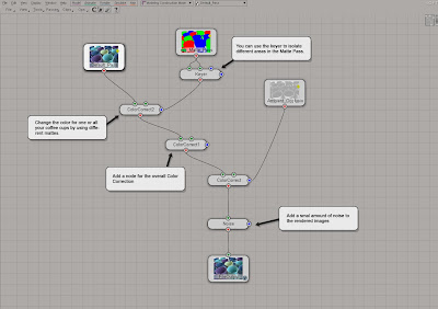 Step 19In the FX Tree menu, chose Passes > Get All Passes to automatically import the rendered images into the FX Tree. Add and connect the operators to match the accompanying screenshot. Please see the full-size screenshot on the CD for further explanation of the operators’ different settings.
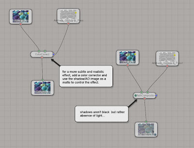 Step 20When compositing the shadows or ambient occlusion, people often simply add the images and set the blending mode (Math Op in the FX Tree) to multiply. However, shadows aren’t black at all but rather absence of light. So for a more subtle and realistic result you should add a color corrector to the image and use the shadow/AO image as matte to limit the effect.
 Step 21
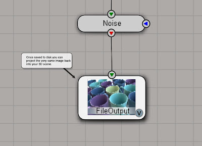
As discussed in the introductory text, effects such as dept of field can bring your computer to its knees if applied in the previous stage unless you’ll settle for the 2d version. However, there’s another way. Open the FileOutput operator and render the composite. Once saved to disk you can project the very same image back into your 3D scene. From the View > Layouts menu, switch back to the Default layout.
Part 5 Depth of Field
 Step 22
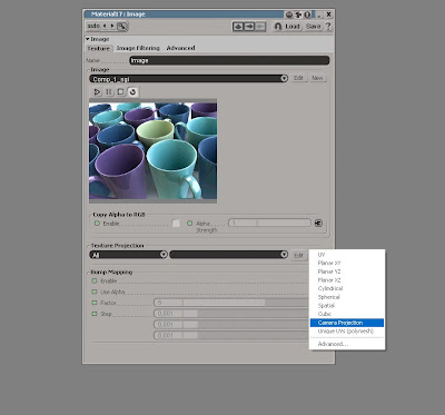
From the Pass > Edit > New Pass menu choose Empty. Name it Depth of field. Open an Explorer and set the scope to Passes. Select the Background_Objects_Partition in your new pass and apply a Constant shader. Click on the Connection icon and chose Image. Click the New button and pick the image you just rendered from the FX Tree. In the Texture Projection section, click New and chose Camera Projection.
 Step 23
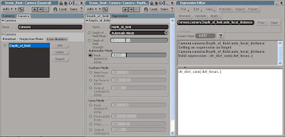
In the Explorer, pick the Camera. Select the camera and press [Enter] to open the camera PPG. Switch to the Lens Shader tab, press the Add button and pick the Depth_of_field shader. Select the very same in the shader stack (the list) and press the Inspect button. Determine which value to enter to get the focus exactly where you want it, let alone animating it, can be a bit tricky if you’re doing it by hand…
 Step 24
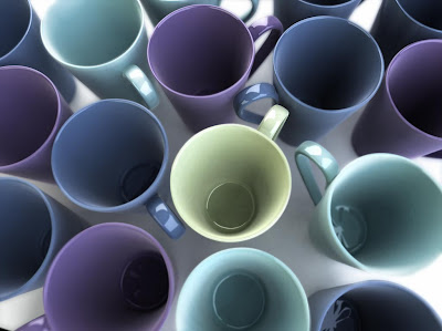
…so, let’s use an expression instead. From the Get > Primitive menu pick Null and name it dof_focus. Return to the dof PPG and right click on the animation icon next to Focal Distance in inches and chose Expression Editor… from the menu. In the Editing Pane (the white area) enter ctr_dist_cam(dof_focus.) and press the Apply button. The expression ensures that the focus will always be spot on the null’s location. Now, play with the nulls position and the Depth of Field Strength parameter in the dof PPG till you’re satisfied with the result. Render the final image and you’ve just earn yourself another cup of that sweet, delicious, irresistible coffee. Make sure you enjoy every drop…


12 comments:
hi.it`s about 4 days that i`m annonce d by xsibase about your blog and i should say.great.it`s great man.keep going.i enjoyed it
best wishes
MEHDI CHALAK
IRAN
Hi Mehdi,
Glad you liked it. I’m planning on adding a couple of new articles after the holidays, so stay tuned for more tutorials...
Kind regards,
Ola
Great tutorials Ola!
I've tried the technique where you texture your object with a camera projection of the rendered image. However I'm not able to get it to work with an animated sequence. The texture seems to slide a little bit. Do you have any insight to this?
Keep up the good work! Väldigt uppskattat!
I just gave it another go and realized that the solution was to change the render manager settings to "End on frame".
Hi Mats,
Good to hear you've got it wokring.. Please let me know if you run into any problems...though my tutorials should be flawless :)
Tveka inte att höra av dej med förslag på nya tutorials. Jag har deadline drygt var 3:e vecka så det är en del artiklar som ska skrivas :)
Regards,
Ola
Studio Lighting Kits are helpful for the professional photographers
Thanks for this great tutorial!
Any chance to have the scene? the download seems to be gone.
Thanks!
Hi Richard,
You’re right. The link doesn’t appear to be valid anymore… the 3D World website has been changed and updated a number of times since the article was written so it’s probably still available somewhere on the site. No need to go searching for it though, just download the project files from here instead: http://dl.dropbox.com/u/3834689/CaffeineAbuse/StudioLighting.zip
Cheers
Ola
Thank you so much Ola! Not only that was fast but also very kind of you to upload the scene again.
That's why I believe a good software, no matter how good it is, isn't enough: what makes it really good is people who use it and SI has a very cool community!
Keep up your great work, I'm definitely a caffeine addicted :)
Cheers.
It would have been even faster if I wasn't forced to dig deep into the archives to find the files from 2006... :)
Hello Ola.
Your blog has always been the place to run for help about XSI.
Please reupload the FX Tree image. It won't enlarge. Really really Thanks!
I don’t know why but blogger and I just can’t get along… I have no idea why the image won’t show the highres version of it, but you can see it by copy and pasting the following link: http://4.bp.blogspot.com/-X6gWf2RnbTE/SJiF2gzvuyI/AAAAAAAAAX0/rWGjwgPTGpM/s1600/fgRender_19.jpg
Hope this helps.
Cheers
O
Post a Comment